
Earlier this month I shared with you the new cover for my ebook Night of the Hell Hounds and Other Stories from the Ridgewood Chronicles, available at Amazon.com. I wrote that the illustration is quite dark and that dark illustrations don’t copy well via Amazon KDP’s POD paperback book market. (I have a couple failed covers to prove it.) And I shared with you the idea of lightening the illustration so I could replace the paperback cover.
But doing that would cut into my time allotted for writing, which I’d just begun this month after taking time off in July to relax and enjoy the summer. So, I chose to gamble away a few dollars for printing, taxes, and shipping costs, and see what the ebook cover would look like on a paperback book.
This is the result:
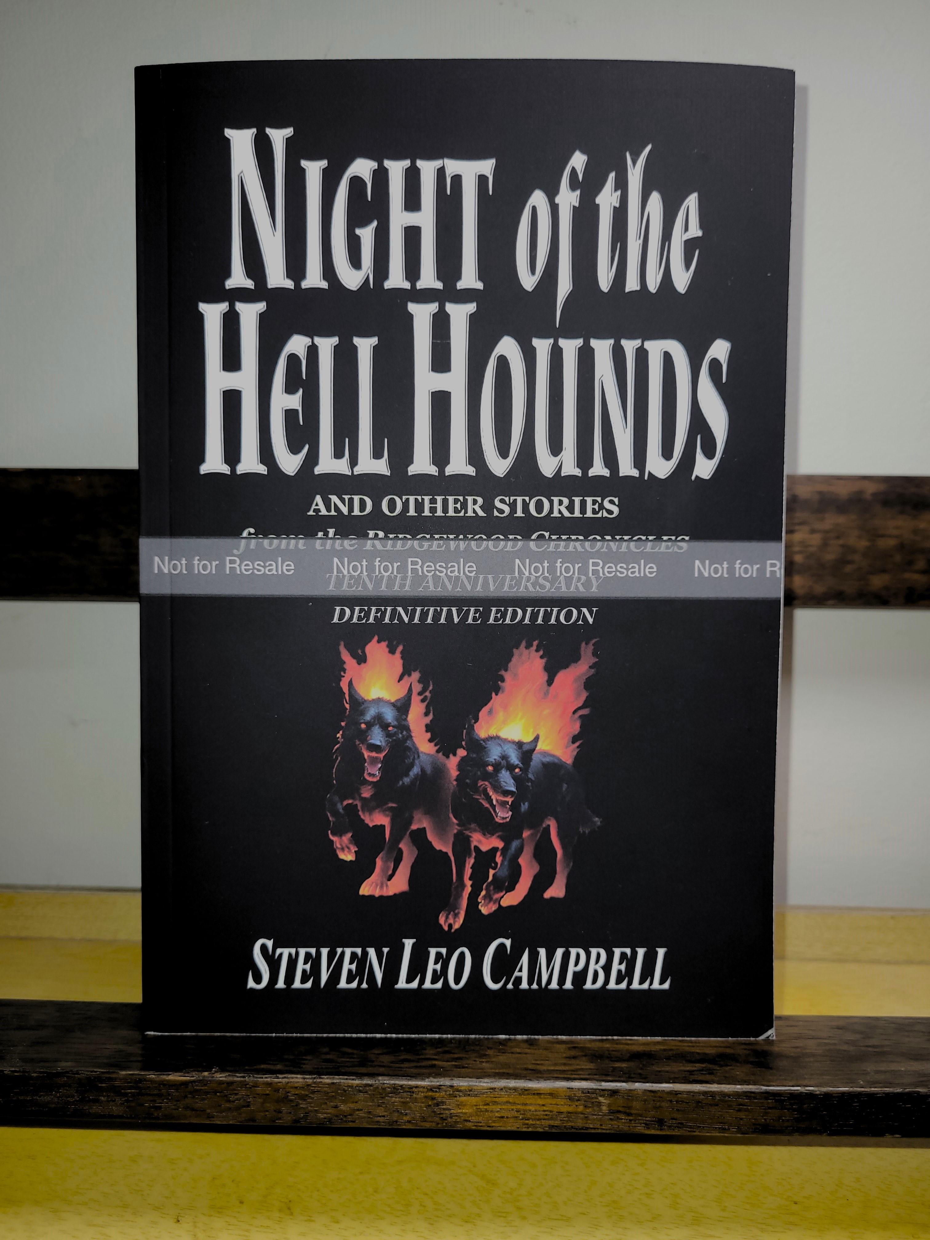
Although the fire and flames lost their saturation in the snapshot from my phone, the illustration actually printed better than I’d imagined. So, it pleases me to announce that the paperback will now feature the newer illustration on its cover at Amazon.
Anyone interested in buying the paperback version of my book can do so here: Night of the Hell Hounds and Other Stories from the Ridgewood Chronicles.
Thanks for joining me today and reading about my adventures in the world of self-publishing books. If you like stories about fantasy, please consider reading my books. I’m still busy getting more books published, so follow this blog for updates and other information.
Until my next post, peace and love to all.
Steve, 8/20/2024
This post “Hell Hound Cover Update” copyright © 2024 Steven Leo Campbell at stevecampbellcreations.com – All rights reserved.

I think the cover looks dark and really cool Steve….it looks better than a lot of Stephen King covers.
LikeLiked by 1 person
Max, thanks for that. It’s interesting that you mention Stephen King, as it’s his old paperback book cover of The Shining that influenced me when I worked on my cover. His book had a simple design of a boy’s featureless head on a silver-gradient background. It’s the best cover design I’ve ever seen for the paperback editions of that book. The rest pale in comparison.
LikeLike
Yes!– a gamble that paid off, I’d say– I think the cover looks great!
I feel I’ve “been there” on this one: so often we compare what’s possible (commercial printing) to what we see on our screens, and lament that the former has less “pop.” It’s tough to make that compromise, but we have to remind ourselves that we’re the only ones who will ever make the comparison and feel any regret!! 😕💦
Great work, Steve!! 👍😊
LikeLiked by 2 people
So very true about comparisons and regrets. 😊 CMYK never pops when viewed via a computer monitor’s RGB code, so it’s a time-consuming procedure to make art online and then wait days later to see the 4-color printed work in person. And then making corrections slows the process down even more. It’s enough to turn a person’s hair gray! 😬 Oh, wait! That happened already. 👨🦳 Never mind. 🤪
Thanks for commenting, Mark. Always a pleasure! 👍
LikeLike